I created the first versus level for Akuto Zero and decided to break it down. Below I will talk about what I wanted from the level, the layout, why everything is where it is, and where I think it can still be improved.
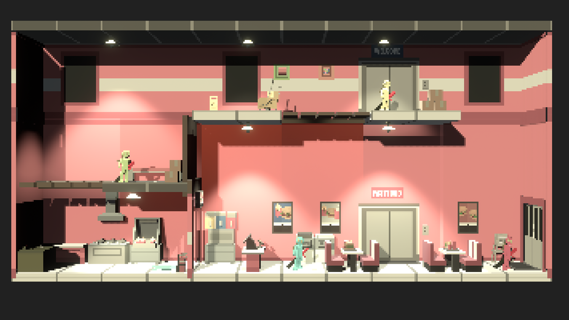
For reference, at the top of this post is a picture of how the level looks like at the start of a match, and below this is a picture of the same level but annotated. It will make sense if you read on.
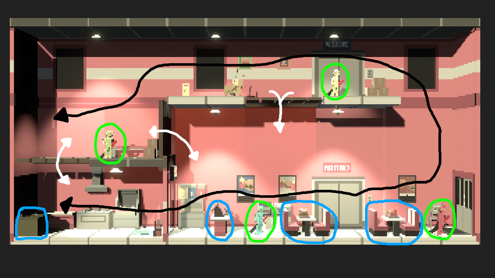
I wanted this first level to be simple, primarily focused on combat. For this reason, I decided to have no weapon pick-ups and a really simple level layout. The black line shows the path the player can take to get around the whole level. It does not look really interesting and from a quick glance it looks like the layout is just one singular path that does not divide anywhere.
This would have created a very boring level, because all the combat would have been focused at the spawn points (the green circles). Players who spawned at the bottom would end up fighting each other and the players who spawned on the upper floors would end up fighting each other. To fix that issue, and to create a better level layout, I created destructible walls (white arrows) which creates new paths on the level and allows the combat not focused upon the spawn locations.
Now players also have multiple choices to get from position A on the level to position B. The second big issue in this game I had to fix was players not being able to kill other players from the other side of the level. This would feel like players got killed unfairly and their opponents were lucky. This wasn’t going to be an issue on the upper floors as they are at different heights, but the bottom floor was all at the same height. To simple fix this, I created obstacles (blue circles) that block bullets and players have to jump on or over to get to the other side of the level.
Now this might sound like a great level, but there is one major issue I have found with this level so far, which is readability. Once the walls are destroyed, the level gets really busy, and it makes it hard to read where the opponents are sometimes. I could possibly fix this by removing items from the level background and making the wall debris smaller.
My goal with the level now is to leave it as it is now and get as many players playing it so it can get tested and get feedback. This will help me to see if readability is actually an issue and if there are any other issues that I should be focused on.
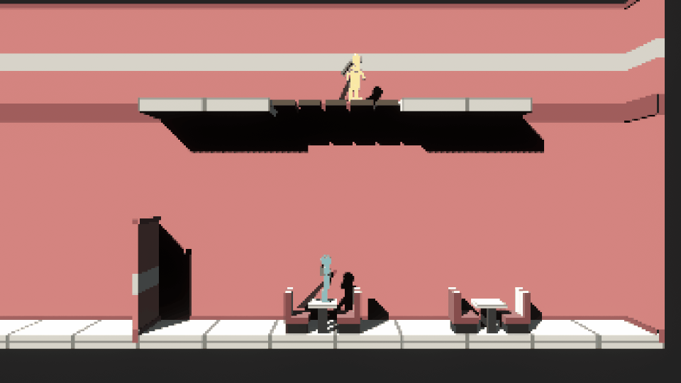
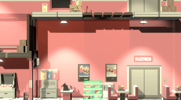
Below are GIFs showing the level near the beginning of development and near the end of development.